
HOW TO CHOOSE THE PATTERN AND COLOR OF WALLPAPER for a perfect interior
Wallpaper stands out as one of the most effective ways to alter the look and atmosphere of your interior space. It has the power to breathe life into dull walls, create intriguing contrasts, visually enlarge or shrink a room, impart warmth or coolness, or simply accentuate your personal style. When choosing the perfect wallpaper, consider the following factors:
- Room size
- Color and style of furniture and flooring
- Room atmosphere and your style
Selecting Wallpaper Color and Pattern Based on Room Size
Generally, large patterns may not be suitable for small rooms, as they can visually diminish the space. Conversely, large patterns on wallpaper can make a striking impact in spacious areas.
Wallpaper colors can have an impact on the perception of room size
Light and bright-colored wallpapers are recommended for small rooms as they create an optical illusion of space. On the other hand, in larger rooms, darker-toned wallpapers can add coziness and intimacy.
Properly chosen color contrasts in wallpapers can help highlight specific elements in the interior or create the illusion of space. For instance, if you want a room with high ceilings to appear cozier, you can use a darker color on the ceiling and a lighter color on the walls. This will visually lower the ceiling and make the walls seem closer together.
Create an optical illusion perfection with wallpaper patterns
Decide for wall stripes as well. If you want to visually enlarge a room, use vertical stripes; for narrowing walls, opt for horizontal stripes. In rooms with irregular corners or uneven walls, choose wallpapers with small and irregular patterns to conceal imperfections.
Choose your wallpapers by rooms
Choosing Wallpaper Pattern and Color Based on Furniture and Flooring
To ensure that your wallpaper complements your interior, coordinate it with the color, style, and material of your furniture, flooring, carpets, curtains, and other home accessories. If your room is filled with various colors and patterns, go for a single-colored or subtly patterned wallpaper that won't disrupt the harmony. Conversely, if your room is simple and minimalist, choose a wallpaper with a bold pattern or motif that attracts attention and adds character to the space.
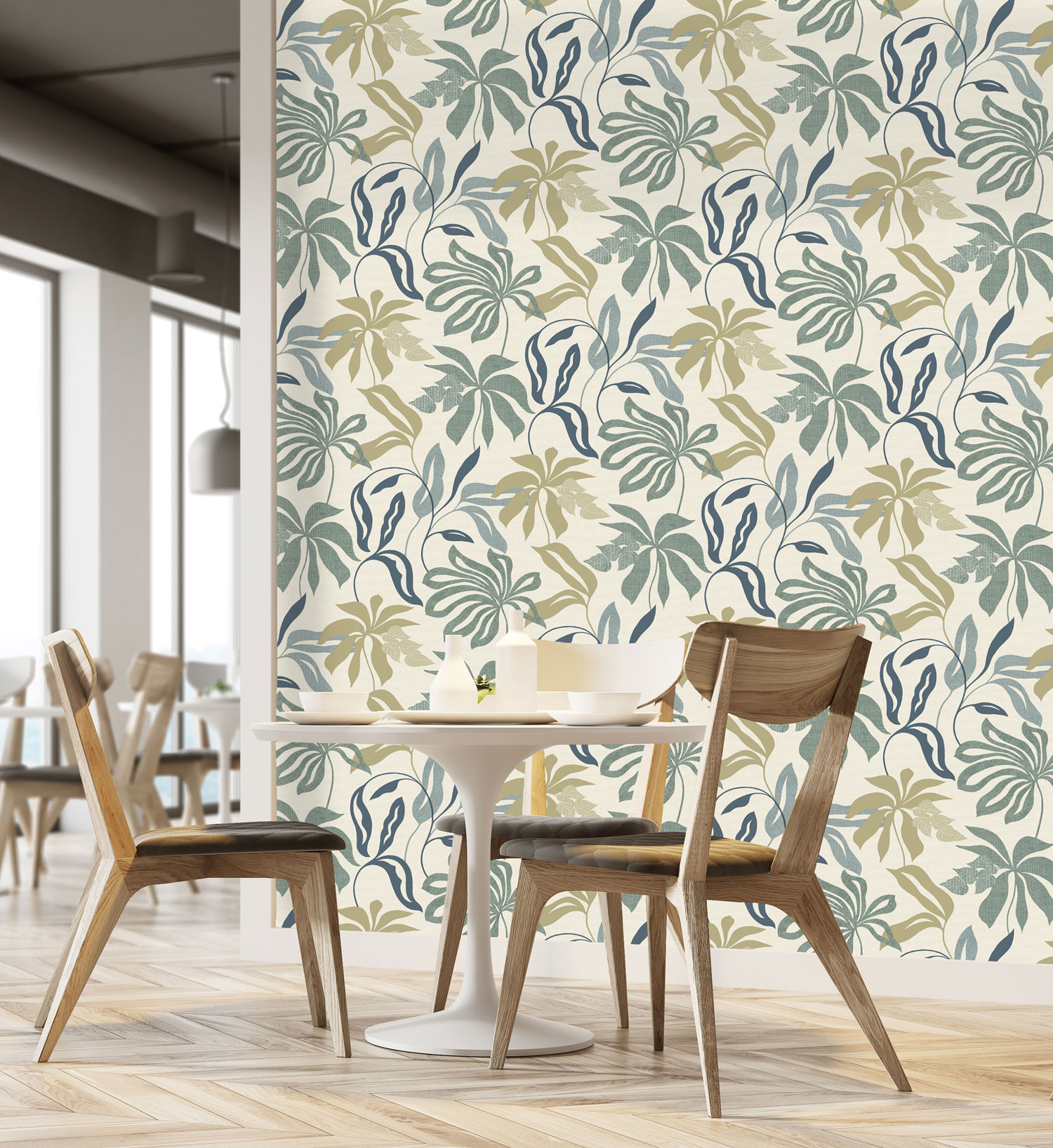
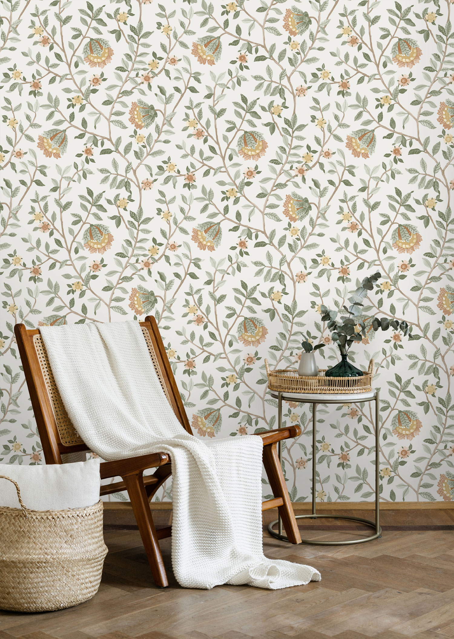
Choose your wallpapers by patterns
Choosing Wallpaper Pattern and Color Based on Room Atmosphere and Your Style
Colors have a significant impact on our emotions and moods, and the colors we surround ourselves with have a greater influence on our mood than we might anticipate. For example, red is the color of energy, passion, and excitement, while blue represents calmness, trust, and intelligence.
Warm colors like yellow, red, bright red, orange, bright orange, or red-orange are traditionally associated with the sun. Therefore, they make a space feel warm, lively, encouraging, active, dynamic, and stimulate activity. On the other hand, cool colors, including green, teal, blue-green, blue-purple, purple, and their shades, cool down the interior, calm the mind, enhance concentration, and provide visual relief. Choose your wallpaper based on color wisely, as it can significantly influence the overall atmosphere of the room and align with your personal style.
Choose your wallpaper by color
